
I have some QoL ideas in mind for the vehicle control screen (things aimed at making it easier for single player or short-crew deployed vehicle management) and for those ideas I need a few more places to display info or put buttons.
In the image below I’ve decided to remove the large-munitions entries from the display, it’s easy to see if missiles, SPG, bots and bombs are expended from the unit graphic, so the AMMO table now only shows guns, rockets, smoke, flares and fuel, and we now show the ammunition totals rather than each individual weapon.
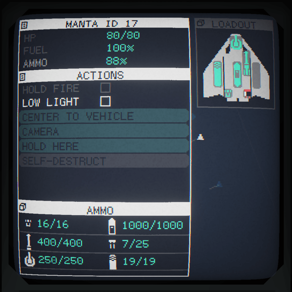
Putting all this into two columns makes much better use of the space.
All that allowed me to clean up the top/middle-left sections, the health and fuel % are now static at the top and the actions buttons are now in a larger scrollable list.

